As the pace of technological innovation within the automotive sector continues to increase, more and more of the analogue interior is becoming the new digital frontier. Apple hopes CarPlay will provide a common visual language to streamline the process.

Last week, the focus was all on Apple's WWDC keynote announcements in San Francisco. They delivered a wide range of software solutions, arming iOS developers with the next generation of digital tools and laying the groundwork for a raft of exciting hardware products in the run up to the holiday season.
Headlines were grabbed by enhanced Photos, audio Messages, smart Keyboards, Family Sharing, iCloud Drive, HealthKit, HomeKit and an entirely new programming language – Swift.
At WWDC 2013, Apple announced its intention to bring iOS to the car, on more than just your phone screen and earlier this year the first serious brand partners were revealed...
I have worked with the automotive industry for nearly 15 years and had much more than a passing interest in cars my whole life. However, I’ve never been a big fan of motoring classics unless influencing contemporary curves, so technological developments inside the car offer a fascinating design and development challenge. How do we bring the screen experience from our pockets to the the dashboard?
On the surface, this would seem a relatively simple step for Apple. iOS7 and iOS8 offer a flat graphic simplicity that lends itself to quick actions accessed at a glance, or effective voice commands for key features. Just the kind of interaction you want when 99% of your attention should be on the road ahead.
Apple’s hardware always follows a beautiful, streamlined aesthetic, free from unnecessary adornments and flourishes. Thanks to last year’s iOS7 overhaul, the software now compliments this perfectly.
The automotive market is a very different animal. Whilst brands may retain a level of consistency and share common components (ie VW Group or GM), they all assume different characters.
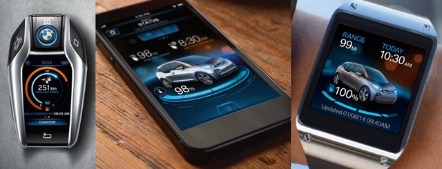
Consistency of digital brand: BMW UI from key to smartphone to smartwatch.
The BMW family screen UI is probably the best example of a diverse range, all reaching for the best on-screen graphics whilst adopting wildly different personalities. The MINI colour palette, iconography and graphics take on a cheeky, playful persona. Rolls Royce provides the polar opposite with layered glass-like panels to match the physical buttons surrounding the main screen. BMW’s conventional range uses a subtle colour palette to identify key functions (Audio, Sat Nav, Phone, etc) and gentle layering of content, with occasional light flares and reflective buttons. The new ‘i’ EV range range takes this a step further with a more adventurous palette and deeper layering for something that wouldn’t look out of place on the bridge of the USS Enterprise... but in a good way.
Graphic vs skeuomorphic, flat vs layered, corporate fonts, colour palettes and screen ratios. These are all graphic elements to take into consideration and there is undoubtedly a fine creative balancing act involved to combine existing branding and features with Apple’s CarPlay interface.
I’ve dwelt on the potential pitfalls but many automotive manufacturers are still offering drivers a pretty poor on-screen experience. Although the latest Land Rover Discovery Vision concept has a full set of screens displaying content that looks as if it could have emerged from Apple’s own creative studio, Tesla offers a comparatively poor graphic interface within the largest digital real estate on the market. The Model S UI is the perfect candidate for a full CarPlay-compatible makeover – especially as Tesla is a shoe-in for Apple acquisition and Elon Musk being Steve Jobs’ true successor-in-waiting.
I digress. Currently, CarPlay is only supporting 3rd party audio apps such as Beats (naturally) and Spotify music streaming services. Future app integration will build on this, with huge potential for voice commands and audio interaction. The focus will always remain on products that don’t distract the driver and offer the continuation of relevant services from phone to car. There’s little point offering everything in the car, in much the same way the compass app is pretty pointless on a smart TV.
Where CarPlay comes into its own is the familiarity through shared interfaces and content. The continuation of basic actions is essential, such as track syncing if started outside the car, then continued once driving. Also, the ability to share mapping data is genuinely useful (this wouldn't have been an option with Apple Maps 1.0). Navigate to a location in your car, then park and seamlessly continue on foot – that’s useful.
So what does the future hold for CarPlay? Apps are dead, right? No, this isn’t about using the internet in your car to replace apps.
Consider the following...
- Mapping data to provide info regarding payment services for parking, admission or valeting
- PassBook electronic tickets issued upon payment to display in-dash and on phone
- Biometric integration – Apple's Health app linked to wearable tech to monitor heart rate and consciousness levels for safety at the wheel
- HUD and gesture recognition – there’s a thought for future generations of iPhone interaction.
CarPlay offers automotive manufacturers the opportunity to streamline their UI and make consumers‘ lives simpler through familiarity. Apple has a chance to lock down another sector into the world of iOS. It’s not a bad place to be.
A version of this article originally appeared in iCreate issue 134