As camera technology changes and social channels multiply, we find ourselves with increasing opportunities to share a visual record of our lives with the wider world. The one constant is the subject matter and how we think about its creative execution. Or is it?

I rarely feel the need to update my blog entries or online articles as they stand as reflections of the moment and passing observations. Occasionally, a product or service upgrade prompts a change of information or time spent with the same requires some additional thought based on a long term review.
I originally wrote the article below as a non-Instagram user, which with hindsight seems a little unfair and ill-informed. All my original opinions still stand regarding composition and over-filtering of images but I'm now sleeping with the enemy… and it's not as bad as it sounds.
The main reason I chose to make the jump was the ability to share. I wanted to broadcast my photography, travels and life experiences through yet another social channel – square or not. I managed to upload 2 years worth of carefully selected 'square-friendly' photos and I'm now up to date.
The photos and videos featured on my other social channels are merely the tip of the creative iceberg. I don't post direct if they won't preview inline so all the rest now lurk on my @activrightbrain Instagram feed.
Here's the original article...
I’m going to be controversial here... I don’t like Instagram. I’m not rebelling against filtered photos or tenuous titling, rather it saddens me that in the quest for the square crop, we’re losing the art of composition.
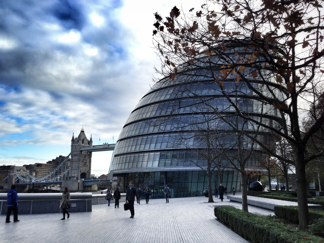
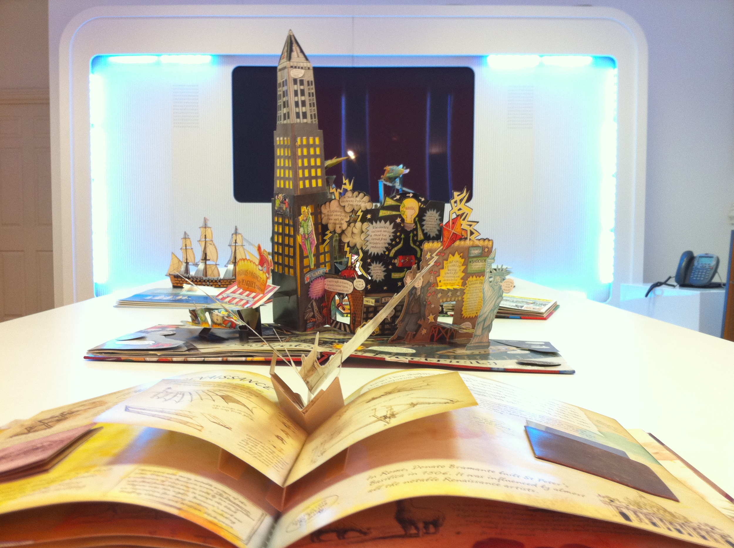
What do I mean by this? Well, Instagram’s square format is perfect for an avatar but when Twitter’s preview image and both Twitter and Facebook’s header are landscape and Nelson’s Column, the Empire State Building and the Eiffel Tower all deserve a format to match their stature, square doesn’t quite cut it.
If you want an image with four sides of equal length, it should be because you chose that crop, not because it was the only option available. My header image (above) certainly wouldn't have worked on Instagram!

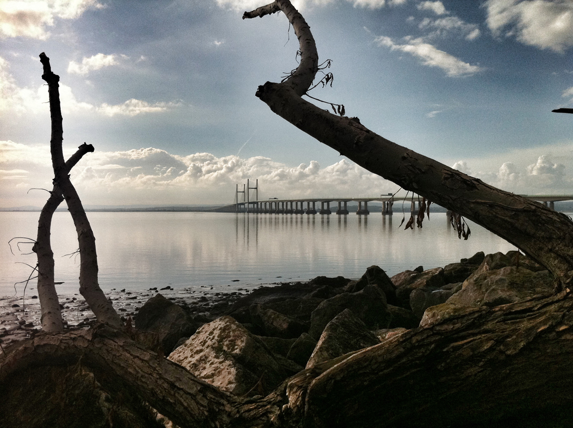
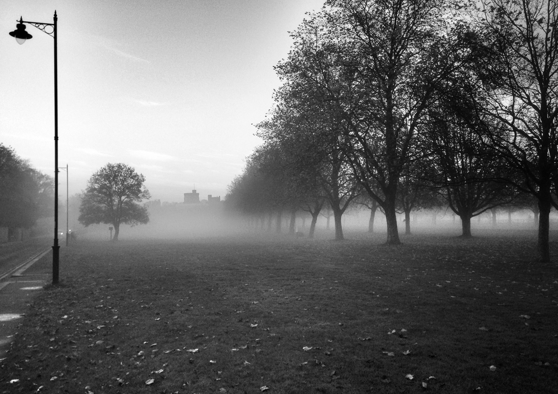
With a full landscape format, we understand the distance jumped and tell a story beyond the captured moment.
The smartphone and tablet revolution has given us more than digital independence or the office in our pocket, it has equipped us with a still and video camera so we’re always ready to capture the moment. Here’s the thing, the screen is a rectangle with a ratio of 4:3 to 16:9 and beyond. It seems a shame not to use the digital real estate.
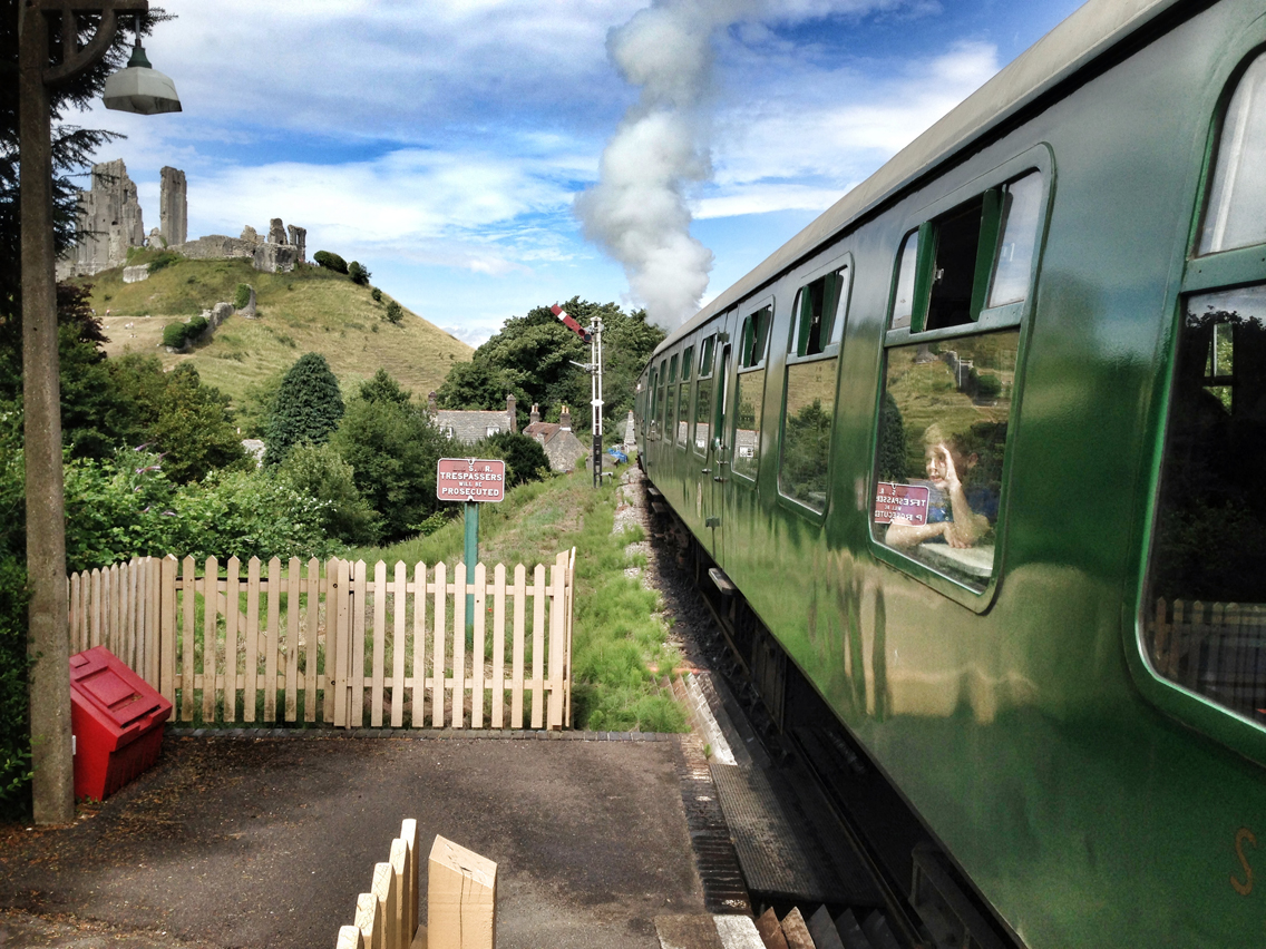
A square crop would have forced us too far from the boy on the train or removed the focus of his attention – the castle.
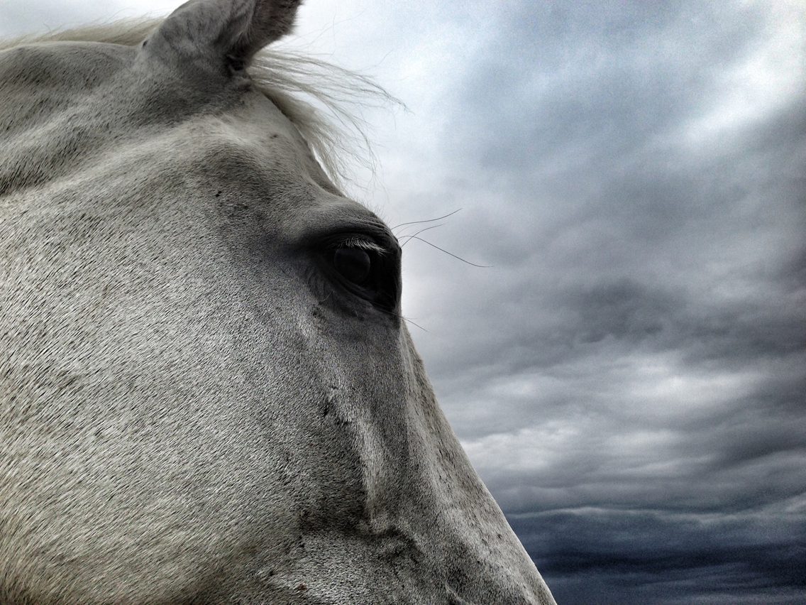
A square format works for video platforms such as Vine (and Instagram) as you can pan horizontally and vertically to capture the full height of a subject or the panoramic vision.
However, in a rectangular viewfinder it’s still the general rule that portrait is better for... portraits and landscape is better for... landscapes. If you really want to be a rebel (or just add impact), try it the other way around.

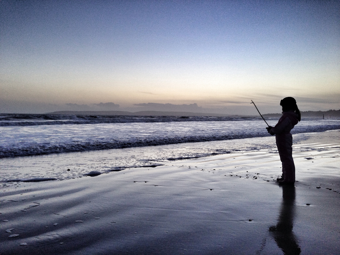
The landscape format illustrates the sheer scale of the beach without overpowering the surfers with too much sand and sky.
I can’t deny I have an interesting life and I love having the ability to capture every relevant second on my own terms. To prove the point, I recently sold all my DSLR kit as this represented hardware dictating the terms. There were fewer and fewer opportunities for me to carry all the equipment with me yet my phone travels everywhere I go, especially with a waterproof case. The phone won, the DSLR lost.

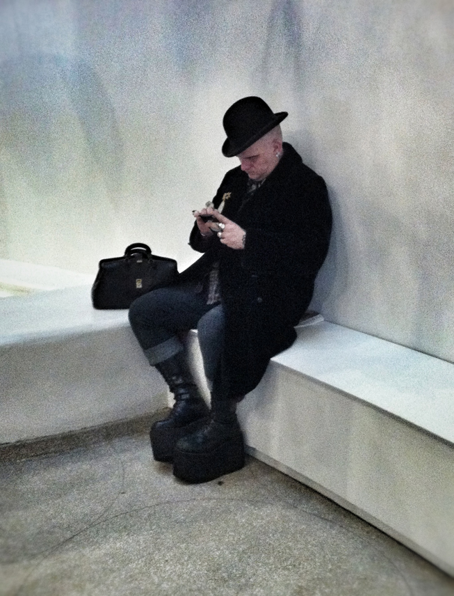
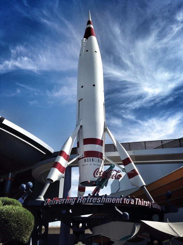
Some images just deserve a portrait format. Without it, they're topped and tailed or given too much either side.
The upside of Instagram’s popularity is the fact that many more people are taking and sharing great photos, I just wish we weren’t settling for a single format when we’ve had centuries of painting, drawing and photography to show us that life’s more fun when you’re not trying to be square.